The Tile
Within the Expenses section is a list of Tiles – credit card transactions, receipts, and imported expenses. The Tile informs the user about transaction details and required actions, but its current design adds unnecessary friction to the overall user experience.
The Anatomy
Before I can address usability issues of an element I first like to understand the components that make the element and their purpose.
Checkbox - useful when selecting multiple expense tiles
Icons - the icons are a visual device used to inform me about missing information and provide additional information about the expense.
Date - informs me about the date the transaction was made or posted
Vendor Name - this tells me the name of the vendor
Expense Type - this is where I categorize the expense based on a predetermined list
Exceptions Explainer - this area provides additional information about the exceptions – the transactions that need attention
Amount - this is the amount that was charged to the credit card or imported from a receipt/itenerary
Requested - this is the amount that I requested for reimbursement
A simplified version of the original tile
Pain Points
Hierarchy
My ability to quickly complete my expense report is dependent on how quickly I can identify and match the vendor name and the amount of the transaction from my physical receipts to an expense tile. So, I adjusted the hierarchy of the information to reflect that.
Vendor Name and Amount are primary
Organization
Date is useful, but primarily for sorting purposes. It makes more sense as secondary information along with Requested Amount and the Location – which was not included in the original tile. I reorganized the information to support the new hierarchy and my goals as a user.
Friction
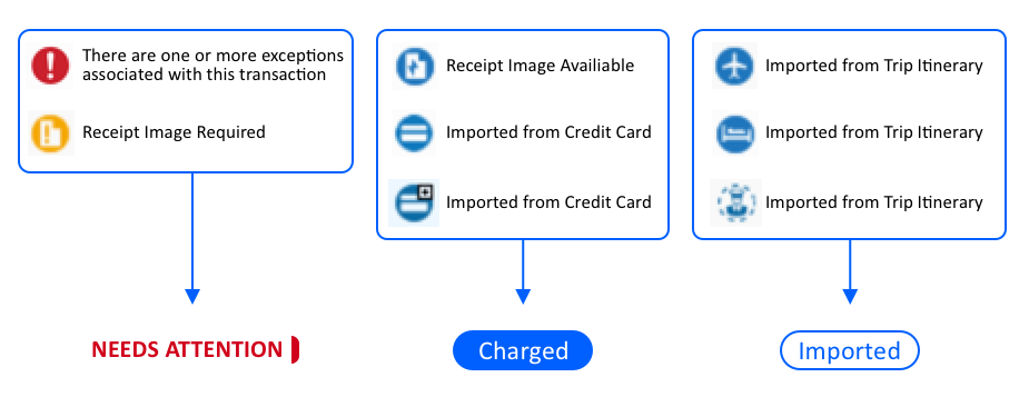
Icons are the element of the tile that I struggle with the most. The current solution creates unnecessary friction and...
Are unintuitive – I have to hover over each one until the alt text displays
Have unnecessary redundancies – many of the icons are variations of the same thing
Have an inconsistent purpose – some show warnings and others just provide additional info
Have an inconsistent interaction – some display a pop-up of additional information when you hover and others are static
It is important to be clear and explicit to prevent the user from feeling unsure or having to guess.
Currently, it is unclear what they mean and if I should interact with them. It is important to be clear and explicit to prevent the user from feeling unsure or having to guess. To address this I replaced all of the icons with 3 simple, clear alternatives:
Final Result
The new tile should feel less busy and more focused – improving overall usability by reducing friction when matching physical receipts to an expense tile.
Expense Tile Before | Selected State
Expense Tile After | Selected State


