
Evaluation Reports
Designing a system for BTE evaluation reports
In this case study, I will share how we developed a design system for BTE evaluation reports. I will detail our process and the tools we used to document and share the system with our team.
Client
BTE
Skills
System Design, UX, Print Design, Information Design

Introduction
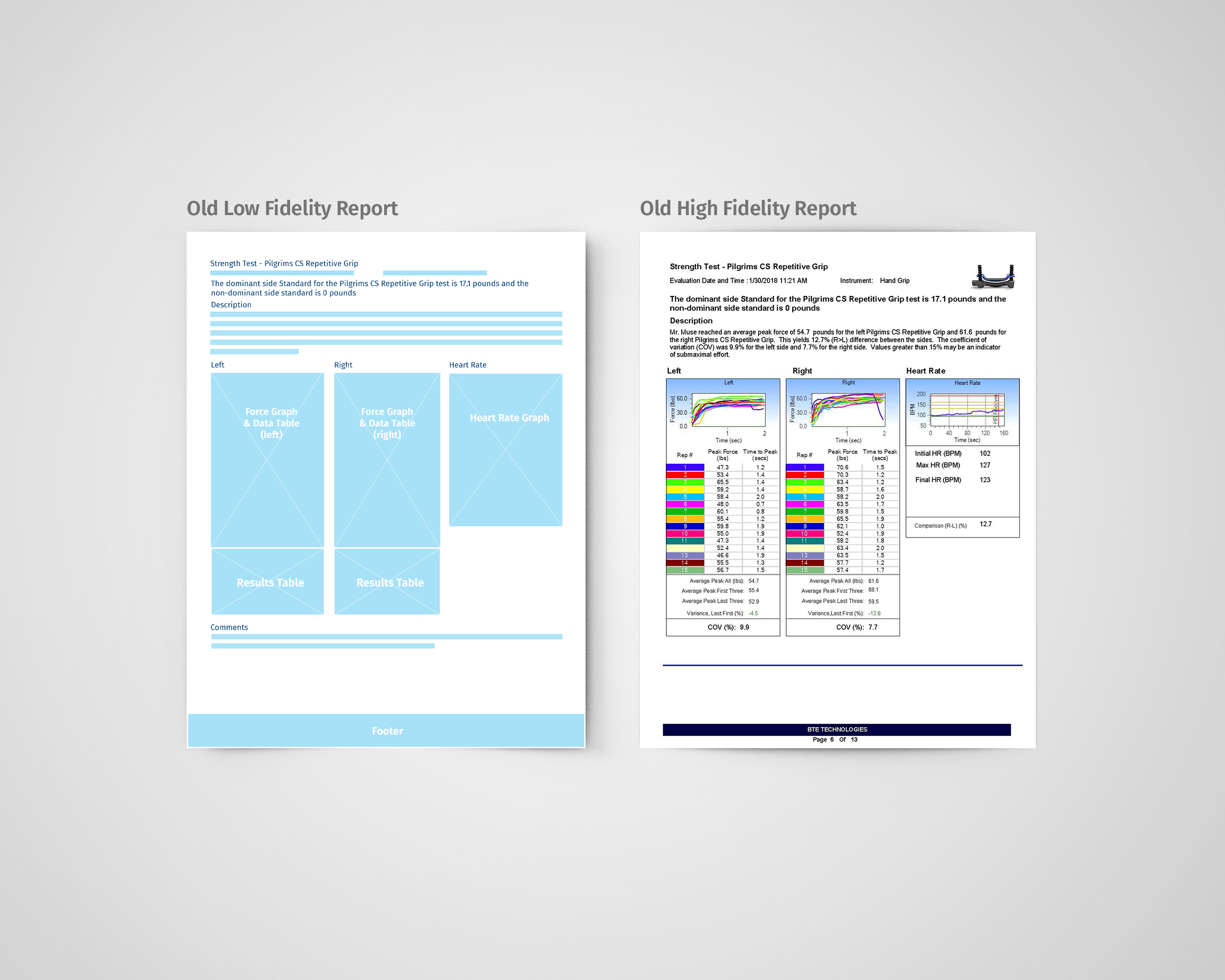
BTE has a suite of products designed only for evaluating an individuals’ physical capabilities. This objective and legally defensible method of evaluation equips an employer with the tools to make fair and educated hiring decisions – allowing them to easily determine if someone can or cannot physically meet the demands of the job. The output of these evaluations is a detailed report with supporting data and conclusions.
After an initial discovery meeting with key stakeholders, we were able to get a clear understanding of the strengths and weaknesses of the current report design, develop user personas, and establish global design objectives for the whole report system.
Objective
Design a system for reports that is flexible enough to cover the array of report types, meets the needs of each of the user personas, and addresses the global design objectives established by the clinical team
Step 1: Building an Inventory
We started with 5 different test types that this system could be applied to and tried to design for edge cases for each. Appliying the principles of atomic based design we developed a system that was effective for the intended medium yet flexible enough to address all of the variables. The ultimate goal being, having the ability to qucikly iterate as their reporting needs expand. We started at the atomic level first – building and inventory and establishing the building blocks of everything we needed to spec.
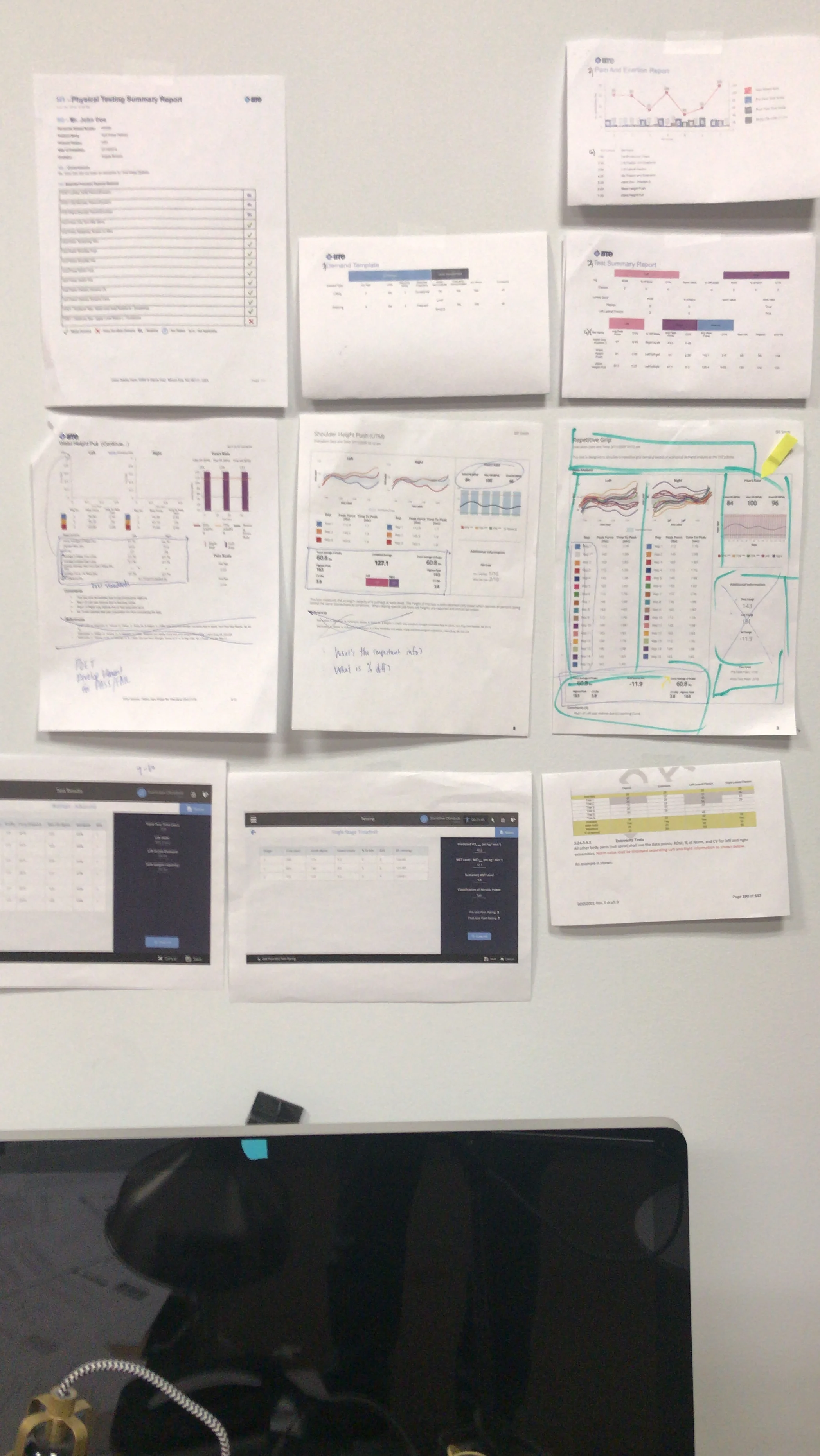
Analysis
We performed an analysis of the old reports and we were able to determine all of the type styles that we needed to spec. This included everything from small, all caps text and body copy to headers (h1, h2, h3, etc.) and header alternates. We also took a look at the colors and noted where applying color was necessary or would be helpful. The primary goal here is to uncover all design inconsistencies across the board.
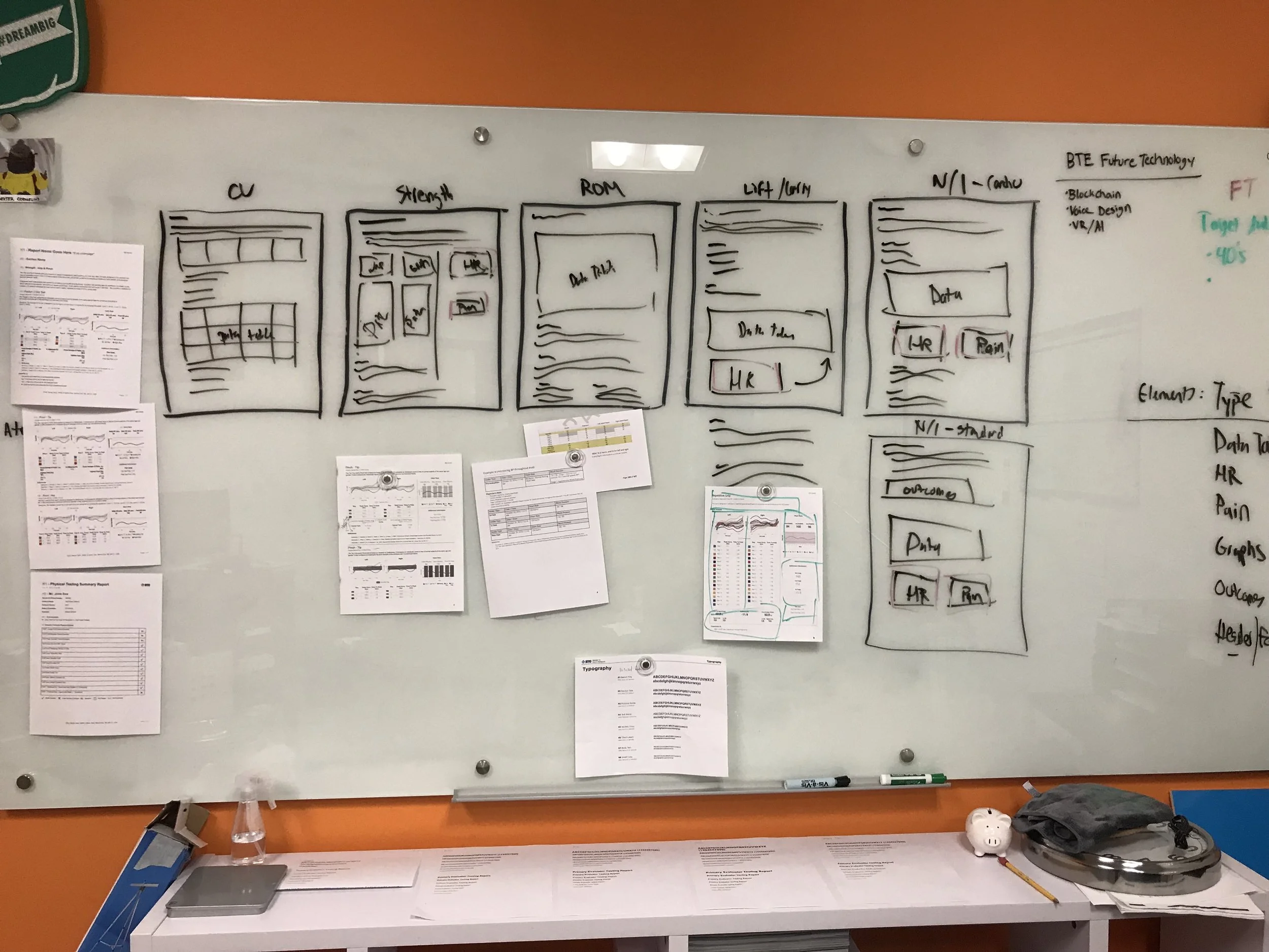
Step 2: Spec the Building Blocks
After laying everything out and taking an inventory of what we needed to spec, we tried and scrutinized a variety of options, but ultimately decided to move forward with the following...
Typography
Based on the early input we received, we knew that improved readability and maximum scanability were top priorities. We made our typographic choices with this in mind. After factoring in all the variables and performing a few line-length & leading type studies we landed on Cambria and Calibri. Cambria bold is a fantastic typeface for headers and pairs very well with Calibri, which strikes the right balance of readability (even at small sizes) without taking up too much space. As an added bonus, both are Microsoft fonts, which means they're automatically installed on every windows system, making implementation easier for the dev team. That's what I call a win win!

Colors
These reports are usually printed in grayscale, so our color choices were heavily influenced by that reality. The system primarily consists of white, black, and grey. We limited color use to the data visuals except for our BTE blue, which we use to highlight important information.
“The optimal line length for your body text is considered to be 50-60 characters per line, including spaces.
”
Grid
Best practices for maximum readability dictate that line lengths should be about 50-60 characters long. The text on the old reports spanned the full width of the page making them about 60 characters longer than the recommended length. We knew this would drastically improve some of their high priority concerns and this became the driving factor that dictated the 3 column grid that we used for this system.

Step 3: Start Building
This is the phase where we started to apply what we spec'd to actual content to help us get a sense of spacing. By doing this we were able to determine the minimum amount of space required for the content to still be effective. This also helped us build our patterns and determine the remaining items that needed to be spec'd out (data visuals, line weights, etc.)
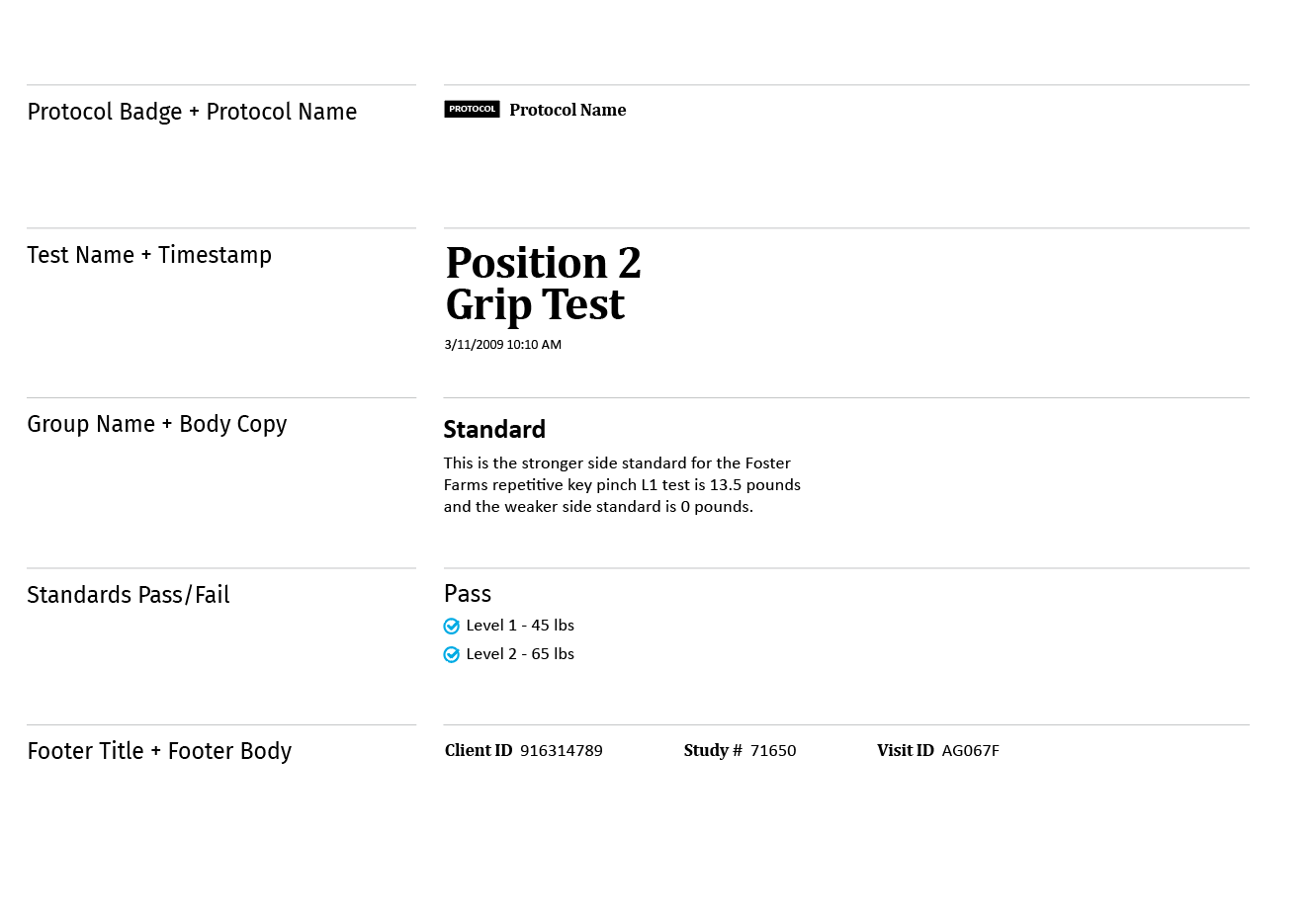
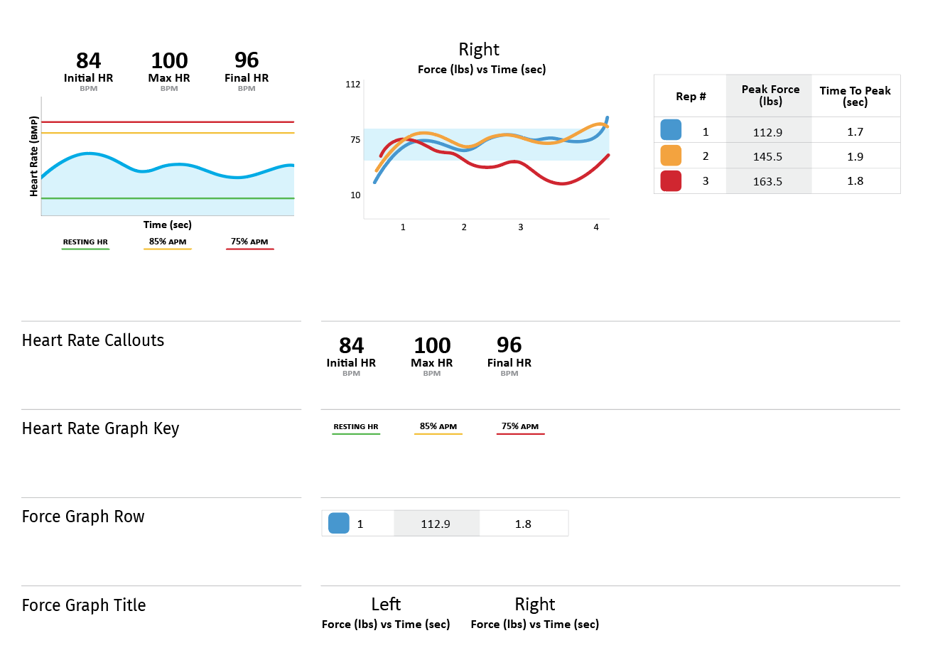
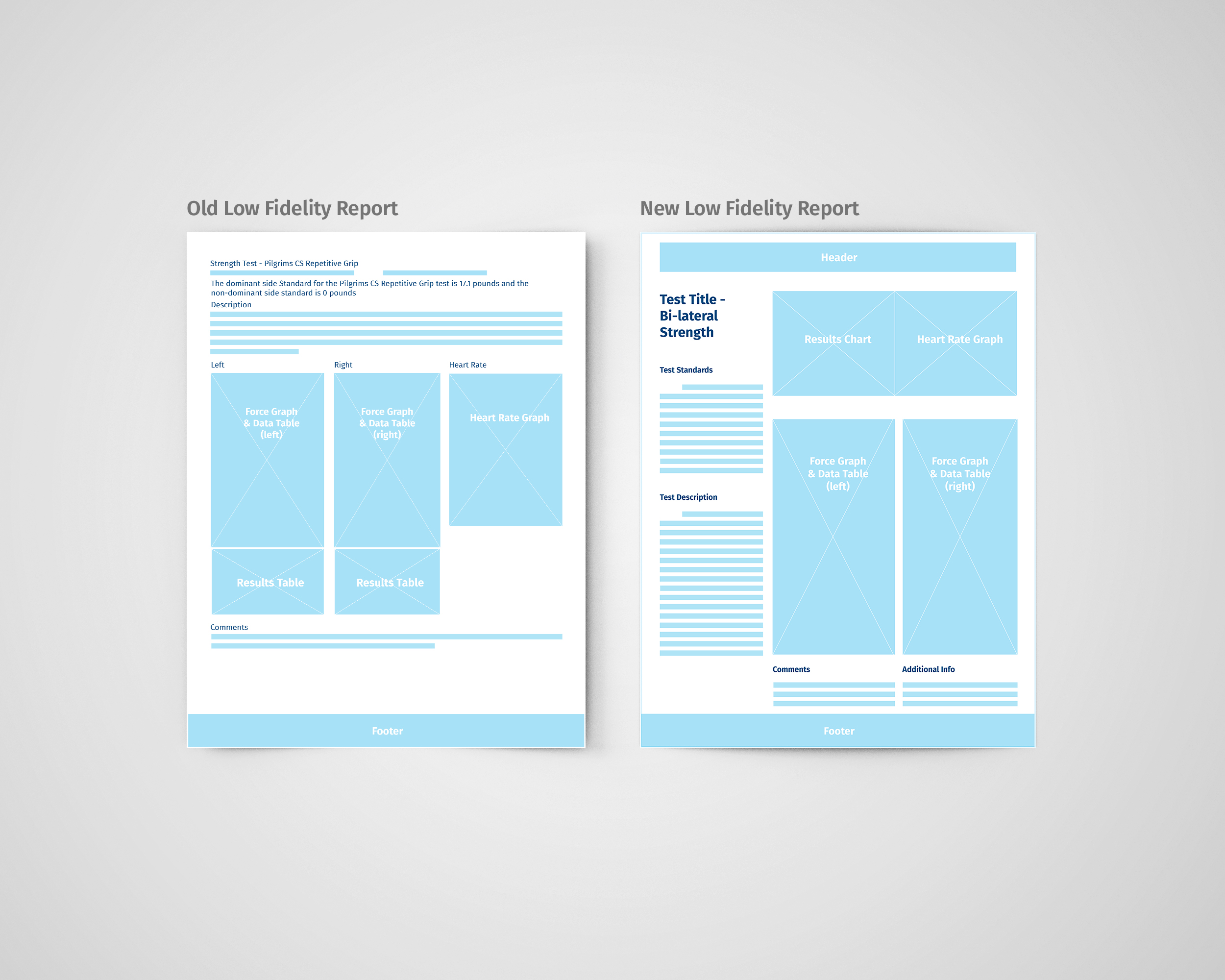
Templates
After building out our styles and elements, we quickly distilled the content down to these low fidelity templates. This helped us address some of the global design objectives that had to do with the fixed placement of key content. With print being such an inflexible medium, designing from the atomic level 1st was an effective approach because it prevented us from running into real-estate issues down the line.

Comparing the new low fidelity wireframe to the old template, it's easy to see the benefit of restructuring the content – using shorter line lengths and clearer hierarchy. As we replaced the wireframe boxes with high fidelity content we began to see the reports come to life.
Final Result
What we were able to achieve by taking the time to exhaust every stage of the design process was a report that drastically improved the readability, scannability, and overall aesthetic and user experience.

Next Steps
User research & interviews
Apply new look to the rest of the report
Document the design system