Concur Concept
A UX Case Study
Client
Dexter Co.
Skills
UI/UX Design
Introduction
Concur is a program that tracks and manages corporate expenses. Whenever a purchase is made with a company card details of that transaction are automatically imported into the Concur system. While the technology behind all of this is impressive I find that I am, more often than not, completing my expense report manually. This experience is vastly different from the automated, seamless experience that they promote – but I don't believe that it needs to be. This exercise is intended to demonstrate how fundamental UI changes can drastically improve the usability of the product. Let's begin...
Objective
Apply fundamental principles of UX design to improve the overall user experience
The Building Blocks
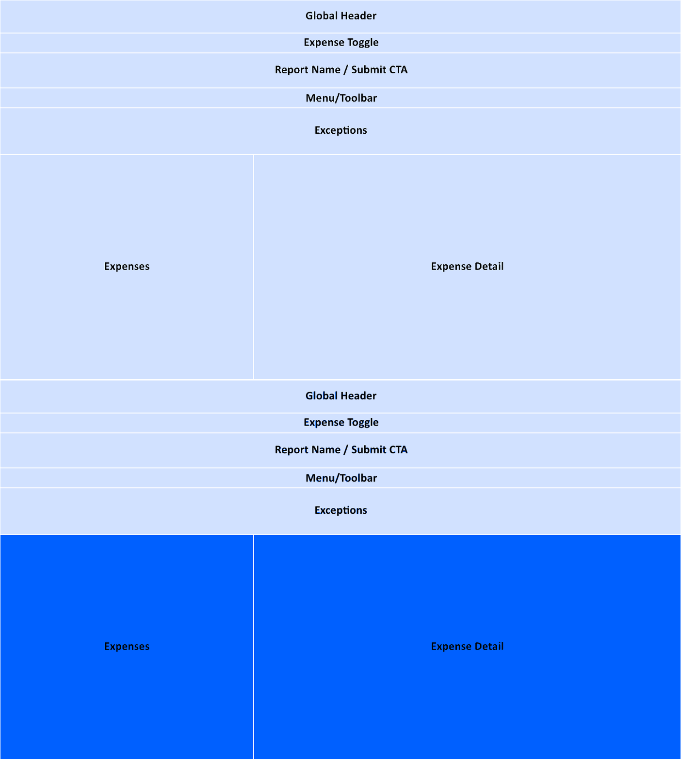
First, let's take an inventory of all the pieces that make up this page. I blocked off the content to help better visualize how it is organized within the page. The two sections that the user interacts with the most are the Expenses & Expense Details. The other blocks are either menus or redundant information.
The Redesign Process
Once the building blocks were established I was able to better prioritize my approach – focusing first on those areas that I engage with the most:
01 - The Tile
The Tile is the most vital and prominent part of the experience. It informs the user about required actions and transaction details.
02 - The Stream
The Stream provides a good big picture view of the whole expense report. Once the Tile redesign was complete, minor tweaks were all that was needed to improve this section.
03 - The Details
The current design of the Expense Details goes against many fundamental design principles. Making these adjustments should result in an experience that's easier to navigate and more familiar to the user.
Final Result
The final result is not just a cleaner design but one that provides more direction, is more consistent with familiar user experiences, and is more aligned with the goals of the user – completing the expense report as quickly as possible.


